

The Most Screenshotted Dashboard on the Internet
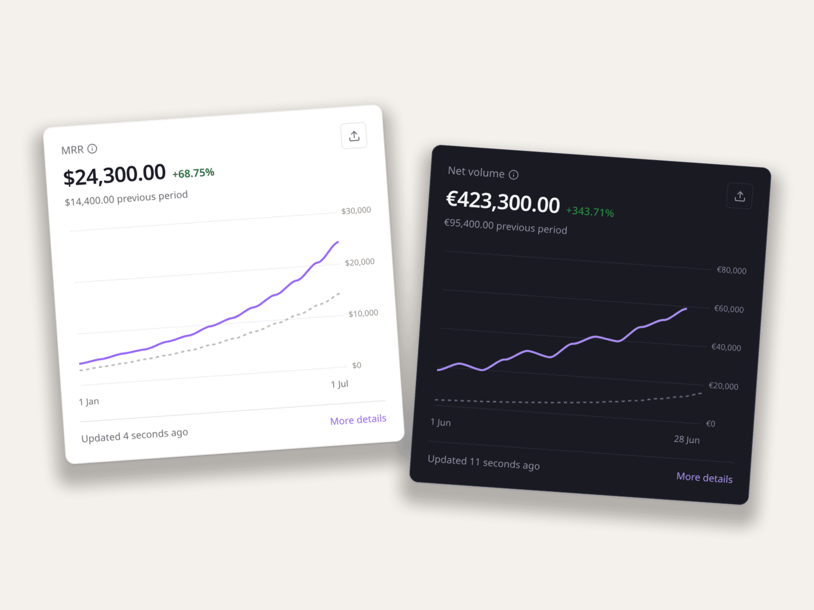
The Stripe MRR chart is the founder's report card. It gets screenshotted into investor updates, "we did it" posts, build-in-public threads, and, increasingly, parodies of all three. The purple line going up-and-to-the-right is so recognizable that it works as a visual shorthand for "startup doing well" even when cropped to a thumbnail.
That recognizability is why I added a fake Stripe chart generator to Mockly's free tools. Not for faking traction (more on that line below) but because the chart-as-image has honest jobs to do in decks, demos, and comedy.
What People Actually Use Fake Revenue Charts For
- Pitch decks and templates. Every deck template needs a "traction" slide before there's traction data. A believable placeholder beats a bar chart made of clip-art.
- Build-in-public satire. The "$0 → $0 MRR, day 60" joke, the absurdly vertical line, the "previous period" flatline. The genre needs the artifact.
- Product demos and landing pages. Building a SaaS analytics or finance tool? You need dashboard screenshots with data you're allowed to show. Generated numbers, real-looking card.
- Course material. Teaching SaaS metrics means showing an MRR chart with numbers chosen to make the lesson's point: churn dips, growth inflections, seasonal waves.
- Film and video props. The startup-drama scene where someone stares at a revenue dashboard. Now it can say exactly what the script needs.
What Makes a Revenue Chart Believable
Real Stripe charts have tells, and the parody only lands (and the placeholder only passes) if you honor them:
- The compare line. The dotted "previous period" line is what makes the card read as Stripe. It also auto-computes the green percentage. In Mockly's tool, +68.75% comes from your two series, not a text field. Numbers that agree with each other are the whole game.
- Wobble. Real growth is jagged. A perfectly smooth exponential is the #1 tell of a fabricated chart. Give the line small setbacks.
- The metric matches the number style. MRR reads as the latest value; Net volume totals the period. Currency formatting, the "Updated 4 seconds ago" footer, the "More details" link: the chrome does half the convincing.
- Plausible magnitude. $24K MRR after 18 months is a believable indie story. $2.4M is a different story with different furniture.
How to Make One
- Open the Stripe chart tool. Free, like the GitHub graph generator.
- Pick the metric: MRR, Net volume, Gross volume, New customers, or Successful payments.
- Enter your points (and optionally the previous period). The headline number and percentage derive automatically.
- Set currency, dates, and theme, then export the PNG. There's also a dedicated MRR chart page if that's the one you're after.
Where the line is
Placeholder slides, parody posts, demos, teaching, and props: fair game. Showing a fabricated revenue chart to investors or customers as if it were real: fraud, and not the fun kind. The tool makes images, not money.
Related Guides
- Fake GitHub Contribution Graphs: Placeholder Data Done Right
- How Agencies Use Chat Mockups in Pitch Decks
- Message Mockups for Marketing Presentations
FAQ
Is the fake Stripe chart generator free?
Yes. It's part of Mockly's free tools. Enter the numbers, export the PNG.
Does the percentage calculate automatically?
Yes. Provide the current and previous-period series and the headline growth percentage is computed from them, so the card is internally consistent.
Which metrics can I show?
MRR, Net volume, Gross volume, New customers, and Successful payments, each formatted the way Stripe formats it, including currency handling.
Is there a dark mode?
Yes, light and dark cards both render.
Can I use these charts in an investor deck?
As clearly-labeled placeholder or illustrative data, yes. As claimed real traction, absolutely not. That's misrepresentation, and diligence will find it.
Start Creating
Sketch the revenue story your slide, joke, or demo needs in the Stripe chart tool, dotted compare line included.
Try it yourself
Create your first mockup in under a minute
40+ apps. Free to try, no signup needed.
Start your mockupMore from the blog

3D Phone Mockups for TikTok, Reels & Shorts
Learn when to use 3D phone mockups for short-form videos, storytime content, tutorials, and product demos. Includes setup and export tips.


How Agencies Use Chat Mockups in Pitch Decks
How agencies use WhatsApp, Slack, Instagram DM, and comment mockups to make strategy decks, campaign concepts, and proof slides easier to buy into.

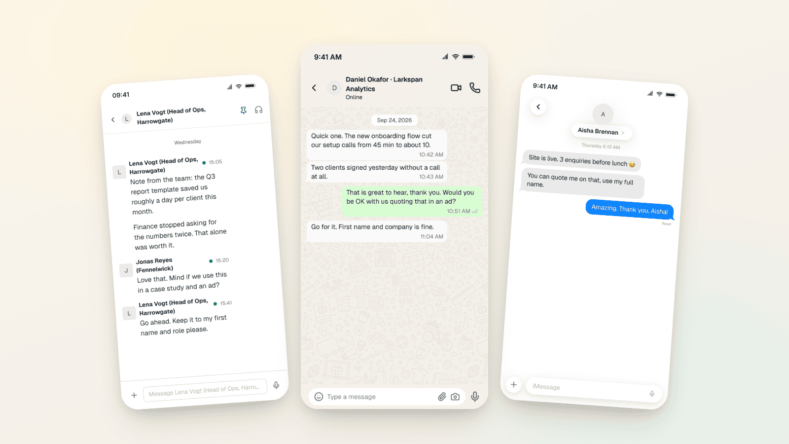
Testimonial Ad Examples 2026: Chat Screenshot Formats
Five testimonial ad formats for Meta in 2026, with WhatsApp, Slack and iMessage screenshot examples, 1:1, 4:5 and 9:16 sizes, and the FTC and EU rules.