
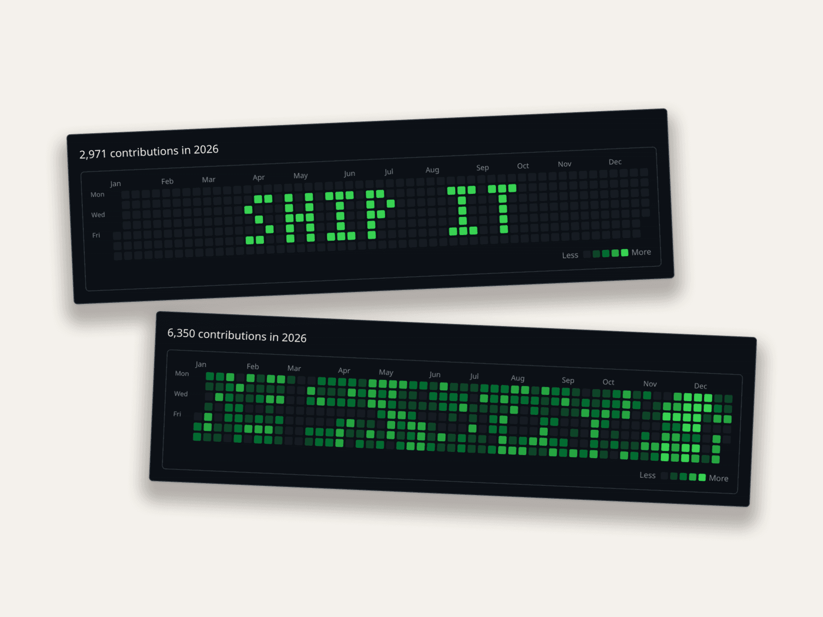

The Green Squares Are a Meme Now
Somewhere along the way, GitHub's contribution graph stopped being a feature and became a status symbol, and then, inevitably, a joke about being a status symbol. "Look at my gorgeous wall of green." "My manager checks my squares." "Day 400 of committing a newline to stay green."
Which is why I built a fake GitHub contribution chart generator as a free tool. Not to help anyone lie on a real profile (GitHub renders that graph from actual commits; a screenshot changes nothing) but because a fake graph as an image turns out to be genuinely useful in a bunch of legitimate places.
What People Actually Use Fake Contribution Graphs For
- The meme itself. Content about developer culture needs the artifact it's joking about. A "my year in review" bit, a "grind culture" critique, a LinkedIn-influencer parody: all need a wall of green you can art-direct.
- Placeholder data in dashboards and demos. Building a developer tool? Your marketing site probably shows a profile view. Real user data is off-limits; a generated graph with believable rhythm is exactly right.
- Course material and talks. Explaining open-source habits, onboarding students to GitHub, or slides about consistency. The graph is the visual, and yours shouldn't expose a real account.
- Design mockups. Any product that embeds GitHub-style activity (portfolio builders, team dashboards) needs the component with controllable states: sparse, steady, streaky.
Type a Word, Get Commit Art
My favorite feature in the tool: you don't have to paint every square. Type a short word or number in the Prefill box and it renders as pixel art across the weeks. This is the classic "commit art" look, where the green squares spell something out, without hand-committing for a year to get it.
About 8–10 characters fit across a year. Team names, "HIRE ME", a launch date, an inside joke for a slide. The contribution count in the header still derives from the filled squares, so even a wordmark graph stays internally consistent. There are also one-click presets (Ramp up, Ramp down, Randomize) when you want a believable year faster than painting one.
What Makes a Contribution Graph Believable
If you're art-directing an organic-looking graph instead of a wordmark, steal these patterns:
- Weekdays over weekends. Most developers' weekends are visibly lighter. A uniform wall of green screams generated.
- A vacation gap. Two blank weeks somewhere. Everyone has them; their absence is suspicious.
- A hot streak. A launch month where everything is dark green. Real graphs have narrative arcs.
- The total does the talking. The header count ("5,342 contributions in 2026") is derived from the squares, so the number always matches the picture. Inconsistency between them is how fakes get spotted.
How to Make One
- Open the contribution chart tool. It's free.
- Paint or type. Click and drag to fill squares (each click cycles through GitHub's five green levels), type a word in the Prefill box for instant commit art, or start from a preset and edit.
- Pick light or dark to match where the image will live.
- Export the PNG. The contribution count in the header updates automatically from your squares.
For dashboards-and-decks work, the same free-tools family includes the Stripe-style MRR chart: same idea, different flavor of placeholder credibility. Browse everything on the free tools page.
Where the line is
An image of a contribution graph is a prop. Using it in memes, demos, slides, and mockups is fair game. Presenting it as your actual GitHub activity (to an employer, say) is lying with extra steps, and one profile click exposes it. Don't.
Related Guides
- Fake Stripe & MRR Charts: Placeholder Revenue Done Right
- How Marketers Use Mockly
- Complete Guide to Fake Screenshots
FAQ
Is the fake GitHub chart generator free?
Yes. It's one of Mockly's free tools. Paint the squares, export the PNG.
Can I write text in the contribution graph?
Yes. Type any short word or number in the Prefill box and it renders as pixel art across the weeks. About 8–10 characters fit. It's the commit-art look without a year of scripted commits.
Does the contribution count update with my squares?
Yes, the header total is computed from the grid, so the number and the picture always agree. That's the detail most fakes get wrong.
Can I make a dark-mode graph?
Yes, both GitHub themes are supported, light and dark.
Can this change my real GitHub profile?
No. It generates an image. Your actual profile graph comes from actual commits, which is exactly why image-based use cases (memes, demos, slides) are the honest ones.
Can I use it in a product demo?
That's one of the best uses: placeholder activity data that looks alive without exposing any real user's history.
Start Creating
Paint a year of green squares, or just type the word, in the contribution chart tool.
Try it yourself
Create your first mockup in under a minute
40+ apps. Free to try, no signup needed.
Start your mockupAbout the author
Maurice Kleine
Founder, Mockly
Maurice Kleine builds Mockly and writes about realistic mockup workflows for creators, marketers, designers, and production teams.
Tags
More from the blog
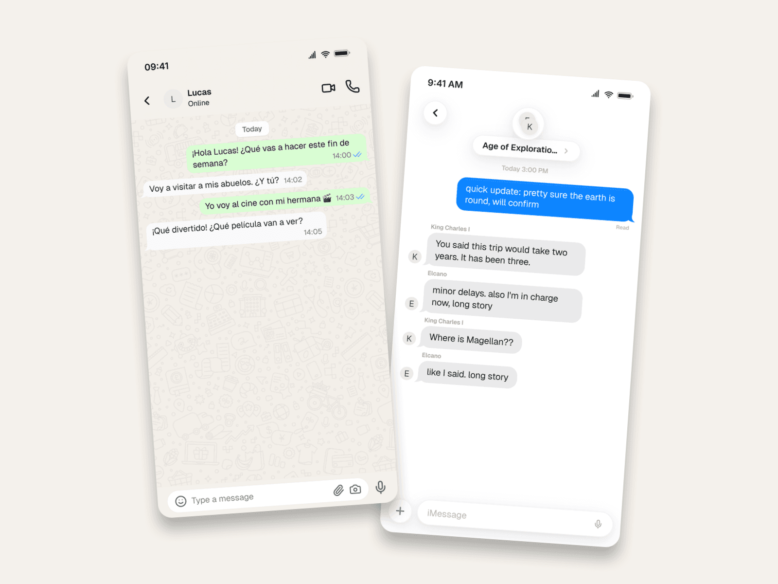
Chat Mockups for Teachers & Course Creators
Use realistic chat mockups in the classroom: language dialogue practice, 'texts from history' projects, and scam-spotting lessons. Examples and lesson ideas included.


3D Phone Mockups for TikTok, Reels & Shorts
Learn when to use 3D phone mockups for short-form videos, storytime content, tutorials, and product demos. Includes setup and export tips.

Instagram Story Mockups in 2026: Story Extend and Multi-Cam
Realistic Instagram story mockups for 2026: progress bar, story ring, a day-old Story Extend example, and a two-angle Multi-Cam frame. Free to try.