

The Short Answer
A mockup feels real when the context, not just the styling, makes sense.
People forgive small visual imperfections. They do not forgive the wrong app, the wrong tone, impossible timestamps, or message behavior that does not belong to that interface.
The Mockup Credibility Index
Use this five-part check before you export:
Format fit
Does the app match the story?
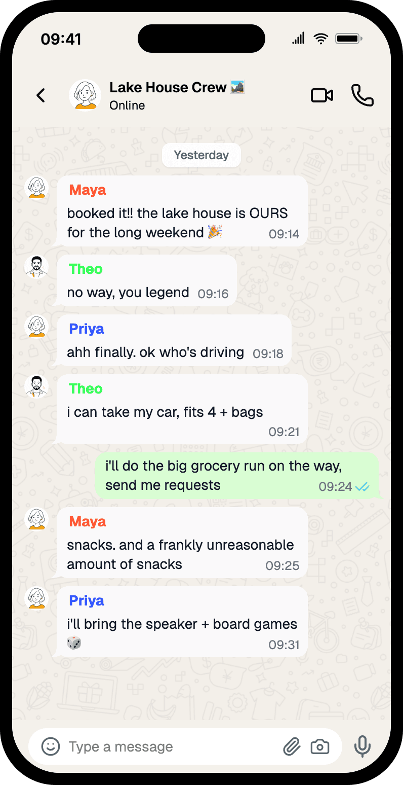
A Slack mockup and a WhatsApp mockup can contain the same words and still communicate completely different things.
Message realism
Do the messages sound like something a person would actually send in that format?
Real chats are usually shorter, more fragmented, and less polished than marketing copy.
Interface logic
Are the timestamps, read receipts, avatars, model labels, or role colors internally consistent?
This is where many mockups quietly lose trust.
Visual density
Can the screenshot still be understood at the size it will actually appear?
An on-screen prop, a deck slide, and a landing-page block all have different density limits.
Channel fit
Is the mockup built for the place it will be seen?
Video, paid social, decks, and docs all reward different framing choices.
Why Styling Alone Is Not Enough
People often assume realism comes from matching the app chrome perfectly.
That matters, but it is not enough. A perfectly rendered interface wrapped around implausible dialogue still feels fake. A mostly correct interface wrapped around believable context usually works better.
Realism Cues by Format
Chat mockups
- Read states
- timestamps
- avatar consistency
- believable message length
AI chat mockups
- correct model labels
- structured responses
- prompt-output rhythm
- formatting that matches the interface
Social and comment mockups
- believable engagement levels
- profile detail consistency
- public vs private context
- content length that matches platform norms
Common Mistakes
Writing for the caption, not the screenshot
The screenshot should communicate the point even if no one reads the body copy around it.
Choosing an app because it ranks well
Search demand and credibility are different decisions. Pick the format that makes the asset believable first.
Forgetting the final viewing distance
What looks good at 100% zoom in the editor may fall apart in a deck thumbnail or a quick cut on mobile video.
A Quick Pre-Export Checklist
- Is this the right app for the story?
- Would a real person send messages like this here?
- Are the timestamps, states, and profile details consistent?
- Can the key line still be read at final size?
- Did you export the right format for the destination?
Adjacent Comparison
If you are optimizing for testimonial credibility, compare Slack vs WhatsApp vs iMessage. If you are optimizing for pitch decks, read how agencies use chat mockups in pitch decks. If you are optimizing for production work, read how production teams create phone screen props.
Try it yourself
Create your first mockup in under a minute
40+ apps. Free to try — sign up to unlock everything.
Start your mockupAbout the author
Maurice Kleine
Founder, Mockly
Maurice Kleine builds Mockly and writes about realistic mockup workflows for creators, marketers, designers, and production teams.
Tags
More from the blog
WhatsApp Group Chat Mockups: A Practical Guide
How to make WhatsApp group chat mockups that look real — group names, sender colors, read receipts, and pacing. Four worked examples you can copy.

How to Make WhatsApp Chat Mockups | Free Guide
Create WhatsApp chat and group chat mockups with names, avatars, read receipts, timestamps, dark mode, 3D view, and export options.
How to Make Fake Chat Screenshots (2026 Guide)
Step-by-step guide to creating fake WhatsApp, iMessage, and Discord chat mockups. Free online generator, no download needed. For marketing and content creation.